RDA x Culture Cave: Translating Movement Into a Visual Language
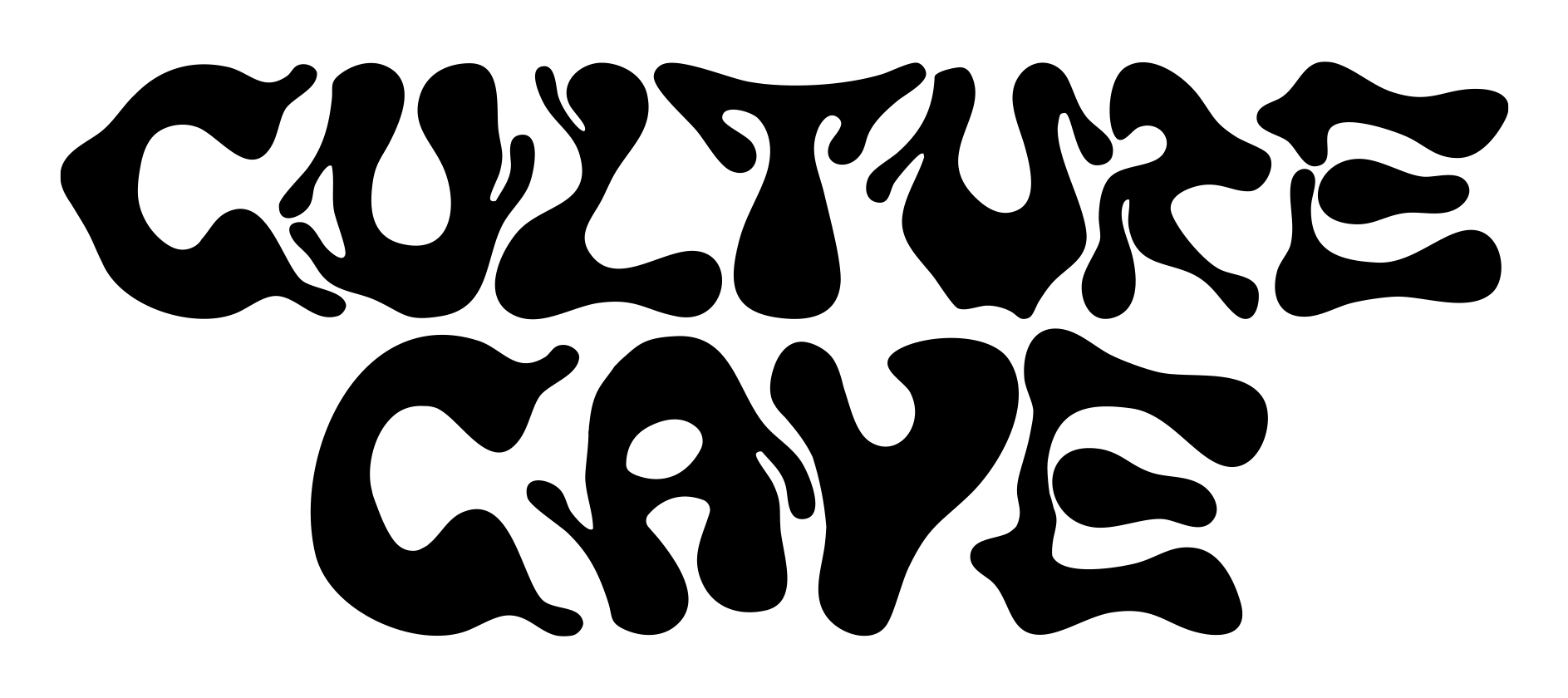
Culture Cave partnered with us to develop a visual identity that reflected more than a series of events. It needed to represent a growing creative community centered around music, culture, and connection. Rather than creating a traditional logo system, the objective was to build a flexible visual language capable of evolving alongside the brand while remaining recognizable across every touchpoint.
Electronic music is built on movement. Every set, venue, and crowd creates a different experience, making it difficult to define the brand through a fixed visual identity.
The challenge was to develop a system that could remain consistent without becoming repetitive. It needed to feel alive, expressive, and adaptable while supporting everything from digital promotion and social media to merchandise, environmental graphics, and future collaborations.
The project began with a simple question:
How do you translate movement into a visual language?
Rather than referencing trends within nightlife branding, the creative direction focused on the emotional qualities of House, Electronic, and Jersey Club music. Rhythm, repetition, improvisation, and energy became the guiding principles for the identity.
The goal was not to imitate the music. It was to visually communicate how it feels.
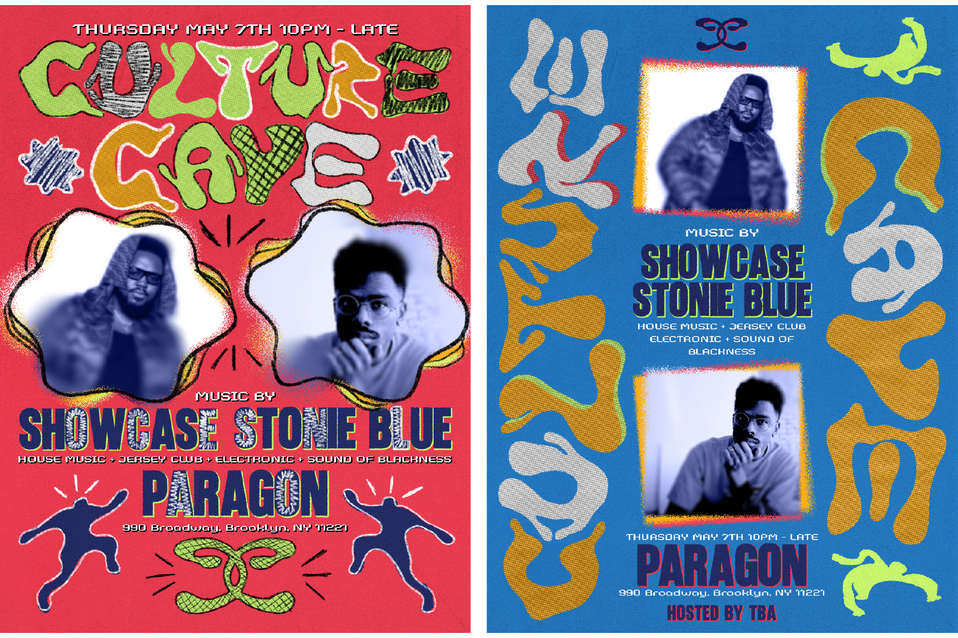
The visual language was built around hand-drawn forms and fluid gestures that suggest movement rather than define it. Every line was intentionally imperfect, allowing the identity to feel spontaneous, energetic, and human.
These expressive elements were paired with a more structured design system consisting of bold typography, strong contrast, and editorial-inspired layouts. The balance between organic expression and refined composition became the foundation of the brand.
Instead of relying on a single graphic device, the system was designed as a collection of visual tools that could expand, contract, and adapt depending on the application.
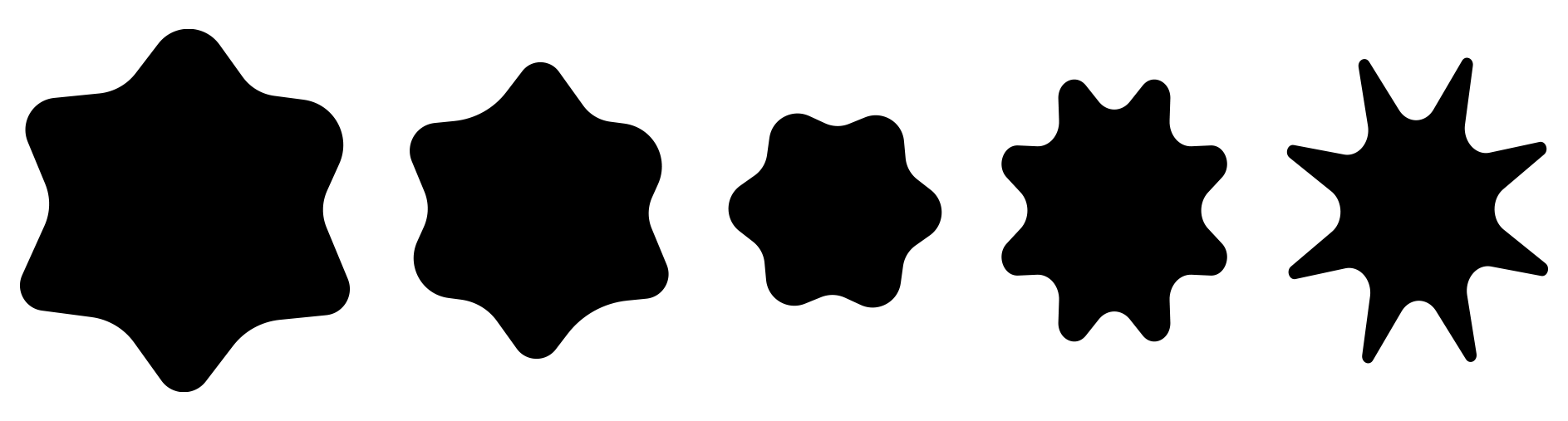
Color became another way to express movement.
Moody, saturated tones establish atmosphere, while vibrant accent colors shift from event to event, allowing each release to have its own identity without losing the consistency of the overall system.
Together, typography, color, composition, and expressive forms create a visual language that feels dynamic without sacrificing clarity.
Rather than designing for individual flyers, we developed a complete identity system capable of extending across digital platforms, print, merchandise, motion graphics, and physical environments.
Every element was designed to work together, allowing Culture Cave to maintain a recognizable presence while remaining flexible enough to grow with future events, collaborations, and creative directions.
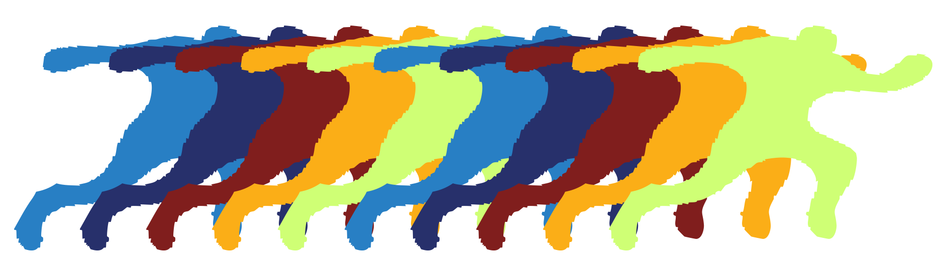
The final identity captures the energy of Culture Cave without attempting to define it through a single visual style.
Instead, it provides a framework built on movement, experimentation, and adaptability. The system evolves alongside the community while remaining unmistakably its own.
More than a rebrand, the project established a visual language that reflects the experience of being inside Culture Cave. Fluid, expressive, immersive, and always in motion.